Helping IT teams automate employee offboarding
3 Month Internship
Research, UI/UX, Prototyping, User Testing
1 Designer, 2 PM, 3 Eng

The Problem
The average employee signs up for over 80 apps. Lumos helps IT teams automatically offboard employees from these apps through integrations. I owned a redesign of the integrations flow to scale for hundreds of newly engineered integrations. Customers had trouble maintaining and managing hundreds of app integrations.
Research
I conducted interviews with 31 chief information officers, and IT heads, managers and leads (target users) at small to mid size companies. I also spoke with my engineers about UX challenges and constraints during an audit of the existing product. I gained insights on target customers’ current processes and discovered 3 shortcomings in our current designs.
01
Manageable
Integrations can break and require additional maintenance over time.
“Integrations can always expire or break over time…there are hundreds to keep track of…”
- Chief Information Security Officer
02
Collaborative
Connecting integrations is a team effort and different teams are responsible for each app.
“There are hundreds of Jira tickets and Slack messages to delegate offboarding tasks.”
- IT Admin
03
Modular
Every integration requires unique user inputs and has different capabilities.
“Every app has different requirements…we automate different tasks from app to app.”
- IT Manager

Ideation
With my entire team, I led an ideation workshop. Discussing prioritization, feasibility, and relation to user insights, I fleshed out ideas for this quarter’s launch. Together, we prioritized requirements for V1 and concepted a north star. This process also helped build buy-in and alignment early on. With requirements set, I prototyped low fidelity designs. My short term goal was to validate more mature designs with target users in 2 weeks.

At the same time, I fleshed out information architecture with considerations to a new onboarding flow to be engineered next quarter. An unexpected challenge was systems thinking and considering how different onboarding paths would impact the UX of the integrations redesign. For example, users who signed in with Google OAuth during onboarding would not need to integrate with G Suite again.

Testing and Iterating
I was able to validate the usability of my designs with 30 target users. I also gained validation as 80% of participants spoke positively about the design’s direction. Below are notable decisions from tests and newfound engineering constraints.
Iterations
Leveraging Progressive Disclosure
By far, the biggest challenge was designing around multiple integrations for the same app. Previously, Lumos only offered one integration per app. Users needed to choose integrations with their preferred actions (insight 3). Below are iterations that led me to reduce complexity despite the addition of multiple integrations per app.

Direction 01
Drawer
The initial hypothesis was to keep things light and minimize clicks. However, a drawer was not scalable for content in the other tabs. Participants also had difficulty quickly understanding differences between integrations.

Direction 02
Single Page
I improved scalability by using a single page. However, users had trouble drawing a relationship between the affordances of each integration (represented by the checks) and the selectable actions on the right. Having too many CTAs also confused users.

Final Direction
Progressive Disclosure
The decision to use progressive disclosure was a tradeoff that added more clicks but reduced complexity. With so many decisions, inputs, and statuses to understand, segmenting key decisions at every step was crucial.
Now, purely informative content (differences between capabilities, statuses and affordances) was separated from user inputs (adding credentials and choosing actions).
Since engineers were building new integrations in the backend concurrently, I was constantly thrown new technical constraints. As a result, product requirements for the app cards varied from iteration to iteration. For example, halfway through the project I was told that an integration’s status is not binary and had to design card statuses to be more explicit (see the change from V4 to V5 below).

Iterations
Refining Integration Statuses
Again, the biggest challenge of this redesign was the complexity that came with offering customers multiple integrations and actions per app. Users needed to know the status of their integrations to maintain and manage them (insight 1). Below are iterations from my attempts to simplify integration statuses.

Direction 01
Pills
My initial goal was to simplify statuses with a single pill per integration. However, I learned from engineering that actions under each integration can have different statuses. Example: “Remove Access” can be connected but “Deactivate Account” can be broken for the same integration.

Direction 02
Pills and Icons
I aimed to make statuses explicit and granular via icons. However, this visually complicated the page and created confusing edge cases. For example, Impersonation has a green pill but there are broken and connected actions (see icons).

Final Direction
Icons Only
The decision to only use icons stemmed from considering all possible edge cases. In this example the header pill is green because “Remove Access” and “Deactivate User” can still occur via Impersonation.
This design also considers scenarios where multiple actions are broken and connected across different integrations. In this example “Remove Access” is broken for all selected integration methods (API and Impersonation) so we let the user know through a red pill in the header.
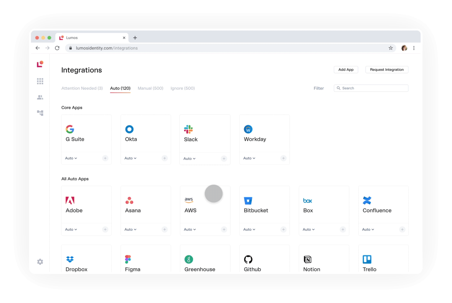
Final Designs
Below are the final designs where users can learn about, configure, and manage integrations.
Outcome
400% increase in acquisition with customers such as Codecademy, Khan Academy, Formlabs, View and RapidSOS.
Retained a high task completion rate despite added steps and UX complexities.
I standardized handoff processes by shipping the first 100 screens in the company’s largest UI refresh.
This project helped raise $4.2M through successful pitches to Andreesen Horowitz and Sequoia.
